
Shat News
Enabling emerging growth.
Enabling emerging growth.
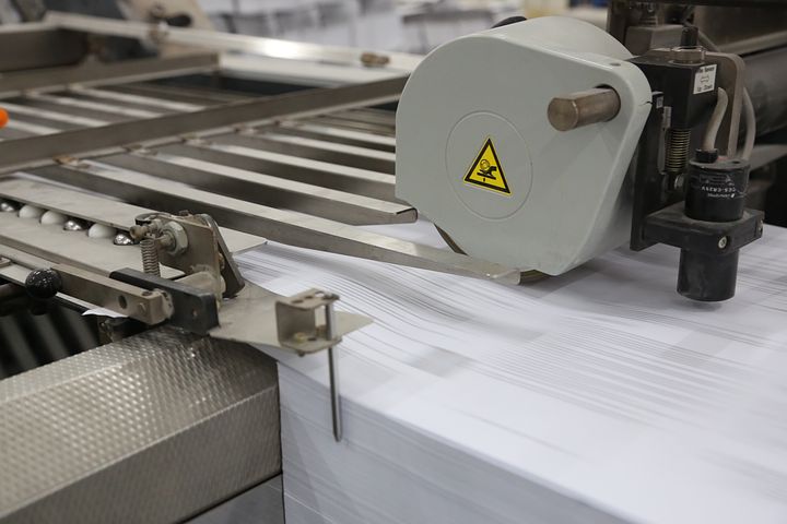
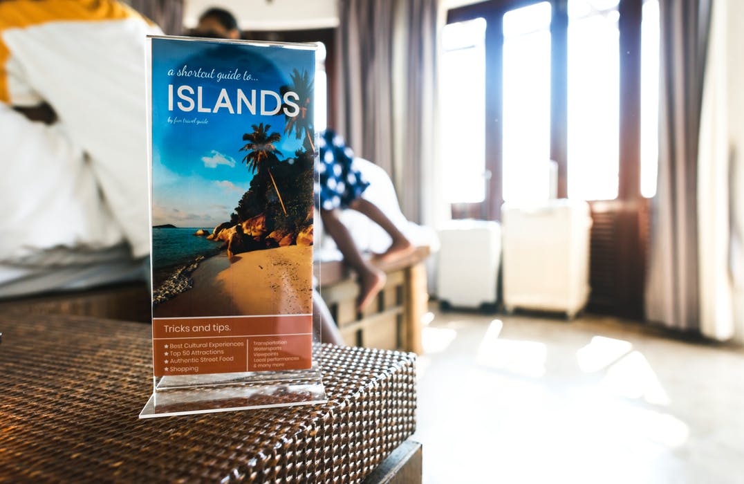
Whether you want to share information about your company or provide an event map to your customers, brochure online printing is an important part of the process. Leaflets are a great way to share easily digestible information about a business, product, campaign, event or service. They are typically folded twice or three times to create a little booklet, of sorts.
It is essential that your leaflet design is well-executed in order to attract and maintain the interest of your audience. A well-designed leaflet gives your potential clients something to remember you by and will encourage them to take action. Here are 7 tips that will bring your leaflets up a notch.
The first step is arguably the most important as it lays the foundation for the rest of the design. You need to know why you’re doing brochure printing. Are you trying to get someone to buy something? Or are you trying to help someone make a decision about their health? Ensure that you gain as much information about the purpose of the leaflet as you can before you start to design it. This will help you communicate the correct message to your audience.
Knowing your audience gives you a better chance of gaining their interest because you’re aware of what’s important to them. For example, if you’re targeting musicians, use a brochure printing design that relates to music! The more specific you can get the better. But if you don’t know your audience, how do you find out about them? Chatting to your customers or salespeople and listening to their responses can help.
In an era where creativity and self-expression is everywhere, it’s become harder (and more important) to stand out amongst the crowd. When brochure printing, you want to create something original and bold, but also something that represents your brand and can easily be identified.
There’s no faster way to turn off your audience than by using colours that don’t work together – or orange. People hate orange. Additionally, different colours evoke different feelings; red can promote action whereas blue can make people feel calm. Of course, if your brand has signature colours, it’s a good idea to use them. Make sure you stick to a colour scheme in your brochure printing that works with the trademark colours.
While it can be tempting to use all 20 of your cool new fonts at once, it’s best not to. Using too many fonts in one piece is hugely overwhelming and unattractive to readers – there are few things that will turn them off faster. Not only this, but using too many fonts makes it difficult to read the text! The right amount of fonts to use is around 2-3 per piece. This is enough to keep it interesting without being too complex.
You’re brochure printing, not writing a book! Avoid including irrelevant information or going overboard with text and images. The more concise your flyer, the better it’s going to retain the interest of your readers. Focus on communicating the most important details and that which will capture the attention of your audience. Extending from this, use simple words, too – long, obscure words can make your readers feel alienated and can limit your credibility as a brand.
When brochure printing it’s a good idea to use the best quality paper that you can afford – poor quality, flimsy paper communicates cheapness and doesn’t make a great first impression.
No Comments